Alphabet Lettering
Client |
Role on Project |
Project Type |
Tools Used |
Myself
Graphic Designer
Hand Lettering
Pencil and paper, Hand Lettering, Adobe Illustrator, Wacom tablet
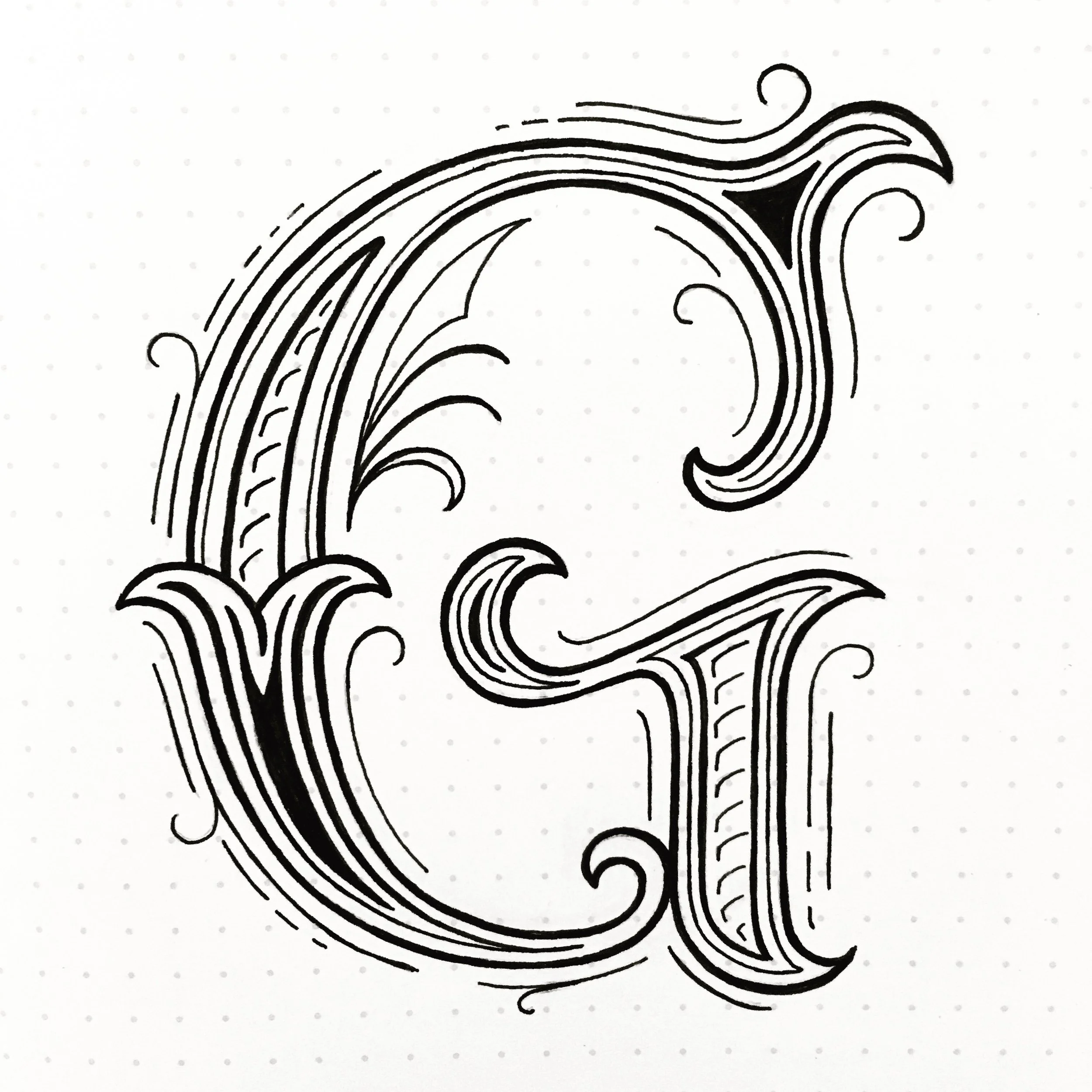
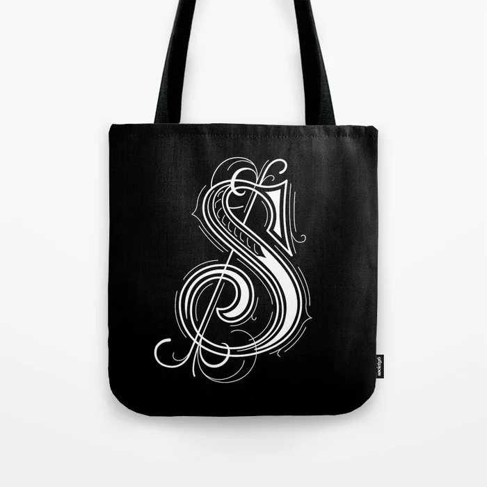
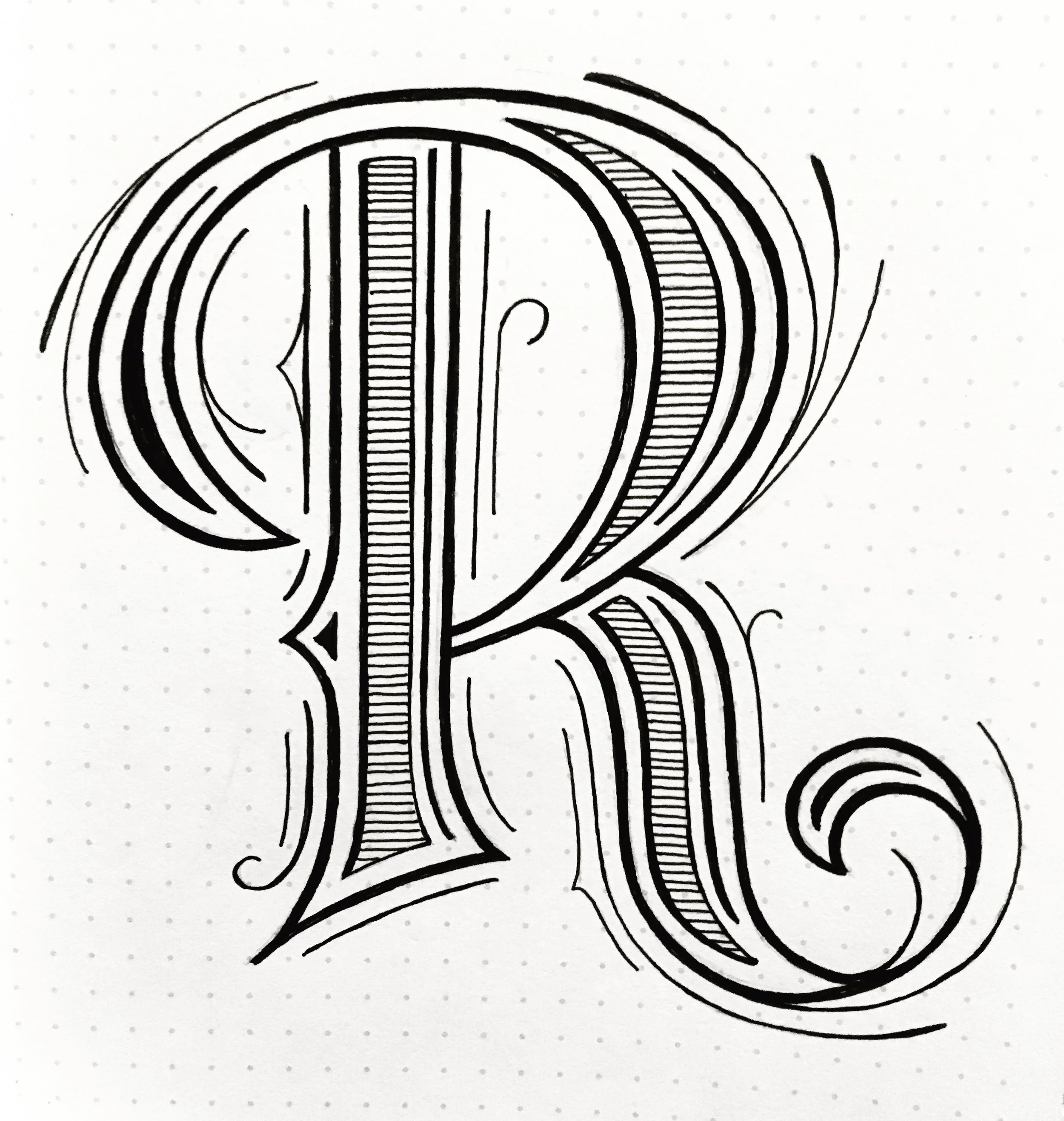
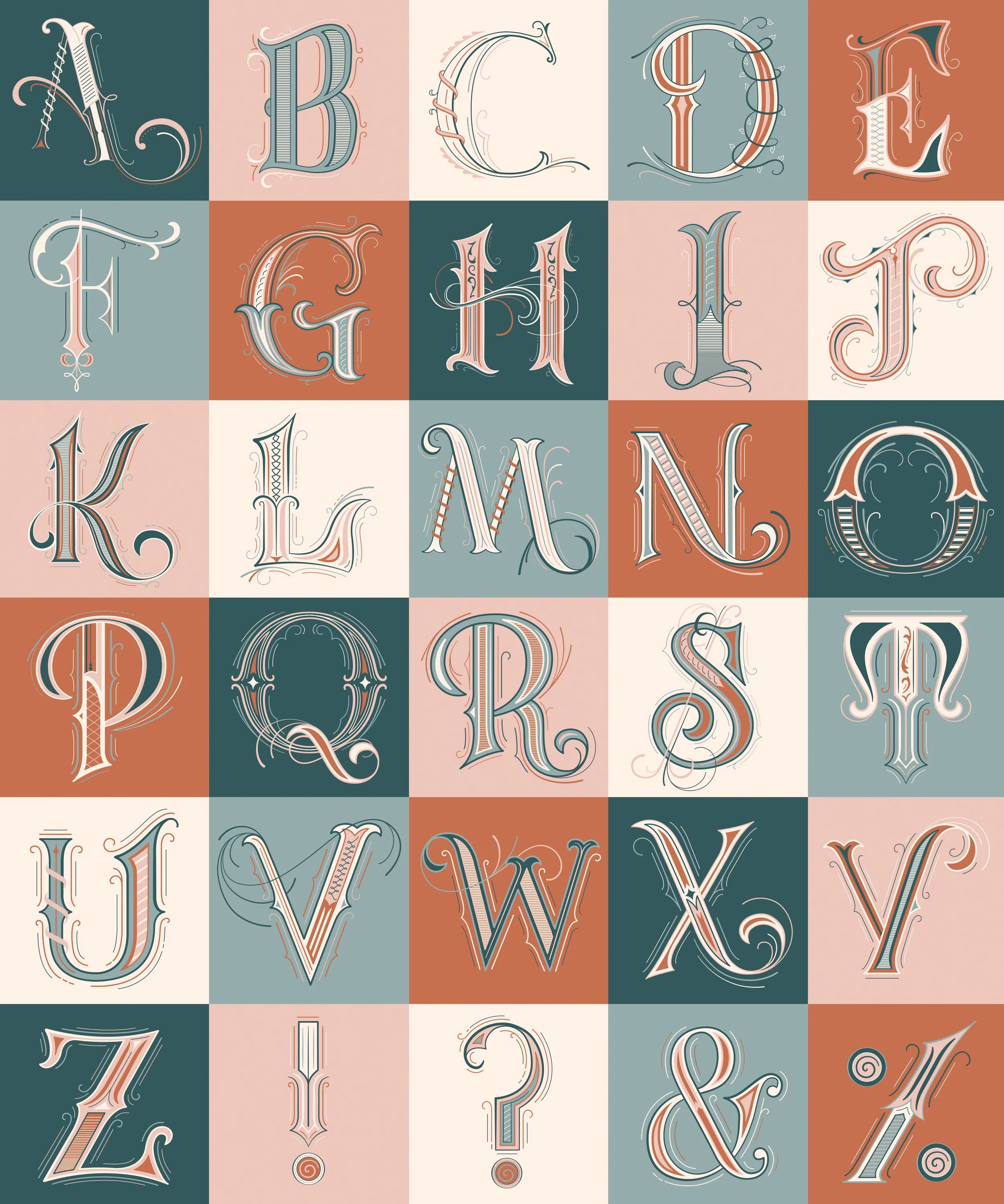
36 days of type is a universal challenge that invites artists to reinterpret the alphabet through their own perspective. For this series, I focused on developing detailed Victorian-inspired letterforms, emphasizing ornate embellishments and refined linework–treating them as drop caps. I wanted to push my skills in lettering while exploring how historical styles can be translated into a cohesive alphabet.
Each day I drew a new letter form in my sketchbook keeping the same style. After finishing the challenge, I scanned in the sketches and digitized the letterforms in Adobe Illustrator.